Branding a new operational resilience start-up
The Client
EMRYS is a technology start-up developing a platform that helps organisations map and understand operational technology (OT) supply chain dependencies. By revealing hidden dependencies, EMRYS helps organisations understand operational risk and improve resilience.
The Problem
As a new business, EMRYS needed to establish a professional, distinctive brand from the ground up. Operating in the emerging field of operational resilience, the challenge was to create an identity that felt trustworthy and intelligent while clearly differentiating the business from traditional cybersecurity providers.
The brand needed to inspire confidence with enterprise organisations and critical infrastructure operators. Alongside the visual identity, the team also required practical brand assets, including PowerPoint templates and supporting collateral, that could be managed internally by non-designers.
The Solution
The project began with a brand strategy workshop to understand the company’s vision, audience and positioning. From there, I developed a single brand concept, establishing not only the logo but the wider visual identity. The logo was then refined through close collaboration with the client during the development stage.
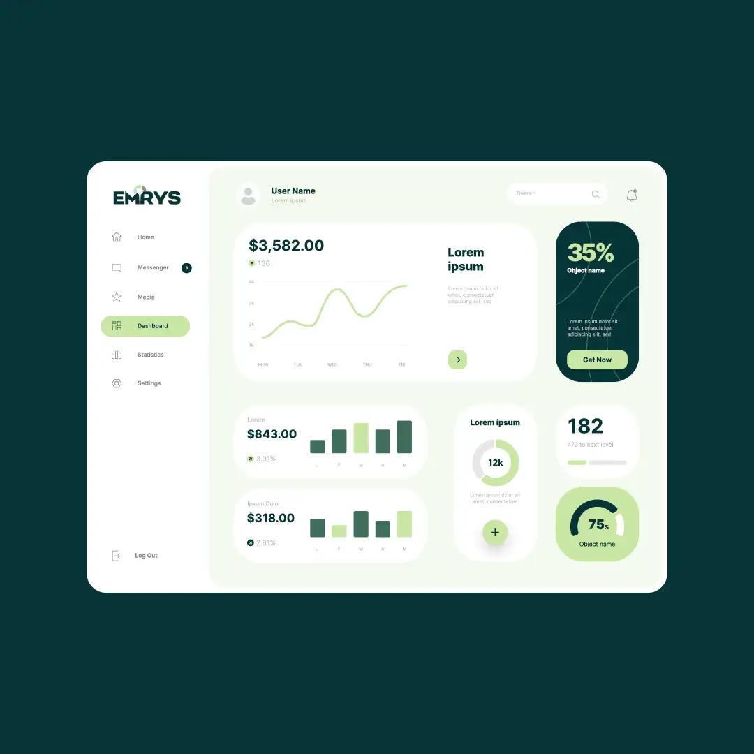
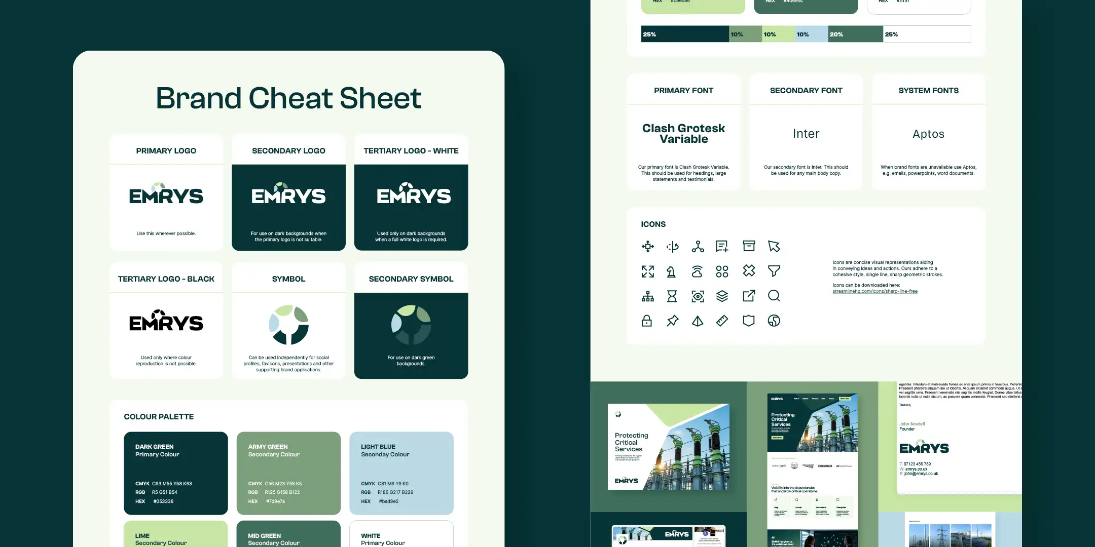
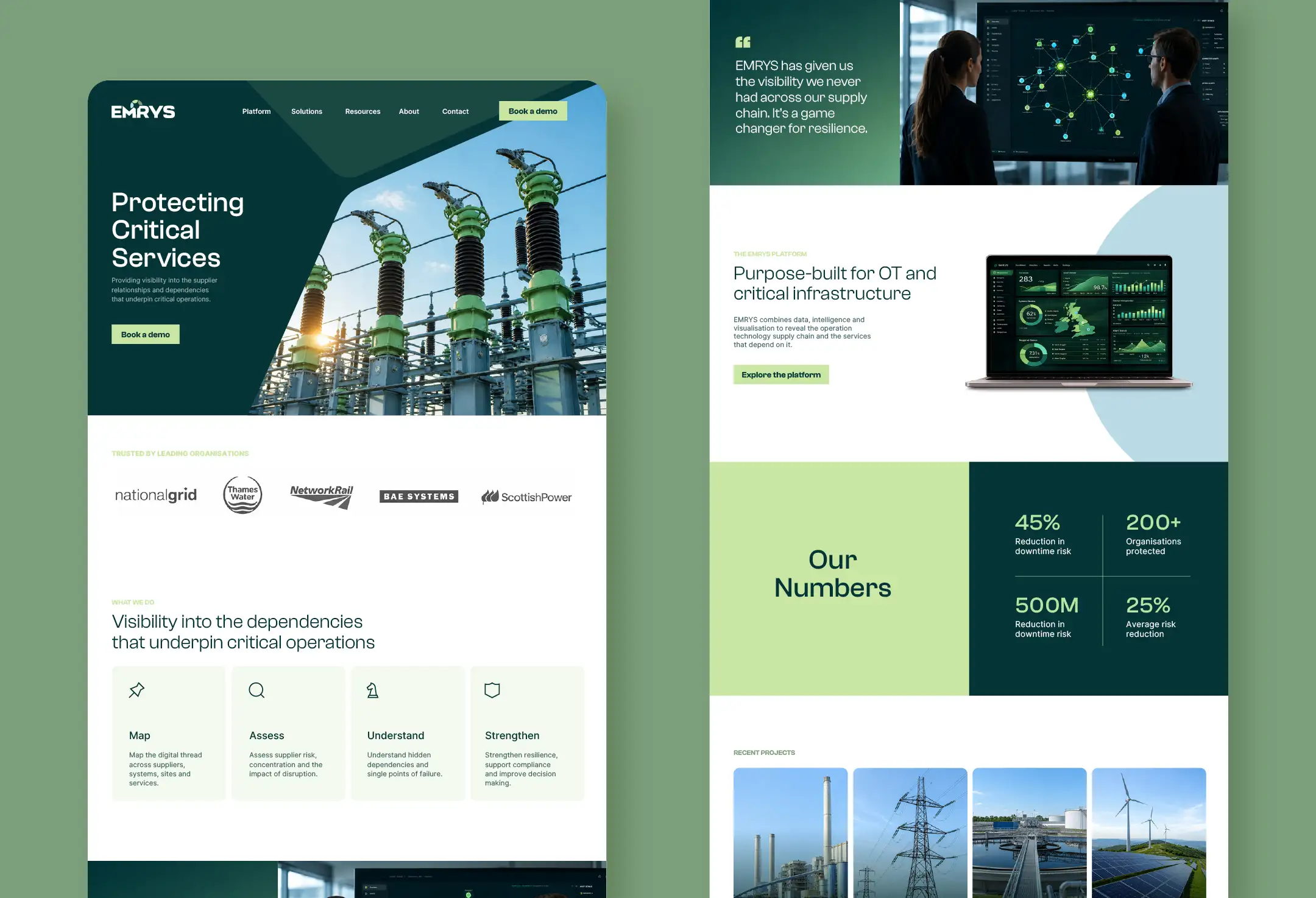
Once the brand identity was finalised, I produced a complete suite of brand assets, including logo files, colour palettes, typography guidance and brand usage documentation. I also designed PowerPoint templates and supporting presentation materials, giving the team a flexible system they can confidently use as the business continues to grow.
The Story Behind the Logo
Inspired by Merlin (Emrys), the logo combines four symbolic ideas into a single mark. The staff represents wisdom and guidance, the surrounding segments symbolise illumination and visibility, the three upper segments reflect the company’s core values, and the completed circle symbolises protection and resilience.