New FinTech Brand
Client: PiQ
Project: Logo Design & Fundamental Branding
Timeline: 1 week
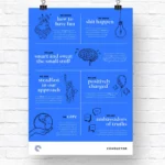
The client, a fintech start up originally called PriapusIQ, needed a logo and fundamental branding for their platform. The platform enables users to curate their own news feed that focuses on market news and commentary that they want to hear more on.
PriapusIQ was abbreviated to PiQ, as this is a more memorable name but I wanted to keep the original name of Priapus as a subtle theme within the logo.
The hidden story of the PiQ logo:
- The Eye: The first element of the logo that you notice. Representative of Priapus, a Greek god who is a protector. This also stood for watching news and focusing on the news you want to see. PiQ could also be pronounced as ‘peek’ also in keeping with the eye.
- The Evil Eye: Priapus’s presence was thought to avert the evil eye
- Parentheses: Signifies important information and represents each news headline
- The Hexagon: Priapus was also the protector of beehives. Many hexagons stacked together represents a hive/hub of information and also stackable content. Each hexagon represents a news module as the platform enables users to curate their news feed
Using the eye as part of the branding can facilitate headlines such as ‘keep an eye out’, ‘focus on the news that matters to you’.
In order to match the logo, young, modern and tech themed colours and typefaces were chosen for the brand.
The new brand enabled the client to include a paywall to the platform and start to generate revenue.